You’ve got the idea, you’ve got the content, and now you’re ready to build your email list. But before those subscribers start rolling in, there’s one crucial piece of the puzzle you need to get right: your landing page. It’s the gateway to your list, the bridge between a visitor and a loyal subscriber. But here’s the thing—most people overcomplicate it.
You might think that to create a high-converting landing page, you need all the bells and whistles—a flashy design, multiple calls to action, maybe even a video. But what if I told you that less is more? In fact, the key to turning visitors into subscribers lies in stripping away the noise and focusing on one simple goal.
Imagine a landing page so clean, so clear, that the only decision your visitor has to make is whether or not to join your list. No distractions, no confusion—just a straightforward, irresistible offer that makes them say, “Yes, I want in.”
But how do you achieve that? How do you create a page that not only looks good but converts like crazy?
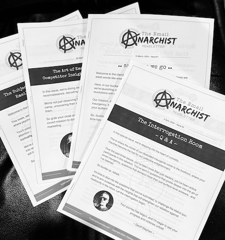
In the latest issue of The Email Anarchist, I’m diving deep into the art and science of creating a landing page that works. I’ll be sharing the exact elements you need to include, the mistakes you need to avoid, and a few tricks that can skyrocket your conversion rates.
If you’re ready to turn your landing page into a subscriber magnet, you won’t want to miss this. The insights in this issue will change the way you think about landing pages—and your list-building efforts will thank you for it.
Ready to transform your landing page into a subscriber machine? Get all the details in the latest issue of The Email Anarchist. Your list-building journey starts here.


